Local Business Logo Design: Jericho Airsoft – Simi Valley, CA
Probably my favorite local business logo design ever, was one of the simplest.
Jericho Airsoft was a massive success story, that started out as a group of friends playing airsoft together, but grew into one of the most successful airsoft facilities in Southern California.
Over the years, I did a lot of work on the local business branding for Jericho, including event flyers, t-shirt designs, hats, VIP cards, and much more.
But it all started with their simple, iconic logo design.
Make Your Local Business Logo Design Communicate Who You Are
The branding for Jericho Airsoft had to say what the facility did, without saying a word.
It had to be clean, crisp, and stand above its class.
To be different in a crowd of similarity, means you compete with absolutely no-one.
The competitors with Jericho Airsoft were mostly paintball parks, which had very bright, loud colors, and contrasting high-energy ‘youthful’ branding.
The only other airsoft field was indoors, and was more aimed at younger players, and ‘run and gun’ style of play.
Many of the players at these other airsoft fields wore paintball jerseys, brightly colored clothing, and were nothing like the style of Jericho Airsoft.
Differentiate: Compete with No-one
Jericho was a more military style facility. Jericho Airsoft field was set up like a military MOUT facility, designed to look and feel like a small Iraqi town. Games were based around military missions, team based, and players often had specific roles to play as medics, etc.
Other fields were not doing this, and so Jericho Airsoft wanted their local business logo design to state very clearly that they were different.
They knew that if they attracted the RIGHT kind of players, that those players would LOVE what they were doing, and very rarely go anywhere else.
Jericho wanted to attract the RIGHT players, and not the wrong ones.
They needed a logo design that showed they were a military style, airsoft only park, that were more serious about their airsoft games, than other fields that just wanted to make money from the hobby.
The Jericho Airsoft Logo Design
There are really just 2 design elements to this local business logo design, the logomark, and the logotype.

Jericho Airsoft Logo Design
The logotype was designed with a basic military stencil design.
This font was chosen to indicate that the games being played at Jericho Airsoft were a MilSim (military simulation) game style unlike the more run and gun sylre games played at paintball parks.
There were no bright colors, paint splatters, or anything that looked cheesy like the other parks were rolling with.
Jericho Airsoft was the only outdoors true airsoft only facility. So, they wanted to distance themselves from that bright colored paintball style.
The main facility was designed to look and feel like a small Iraqi town. So, desert camouflage was the inspiration for the tan in the brand colors.

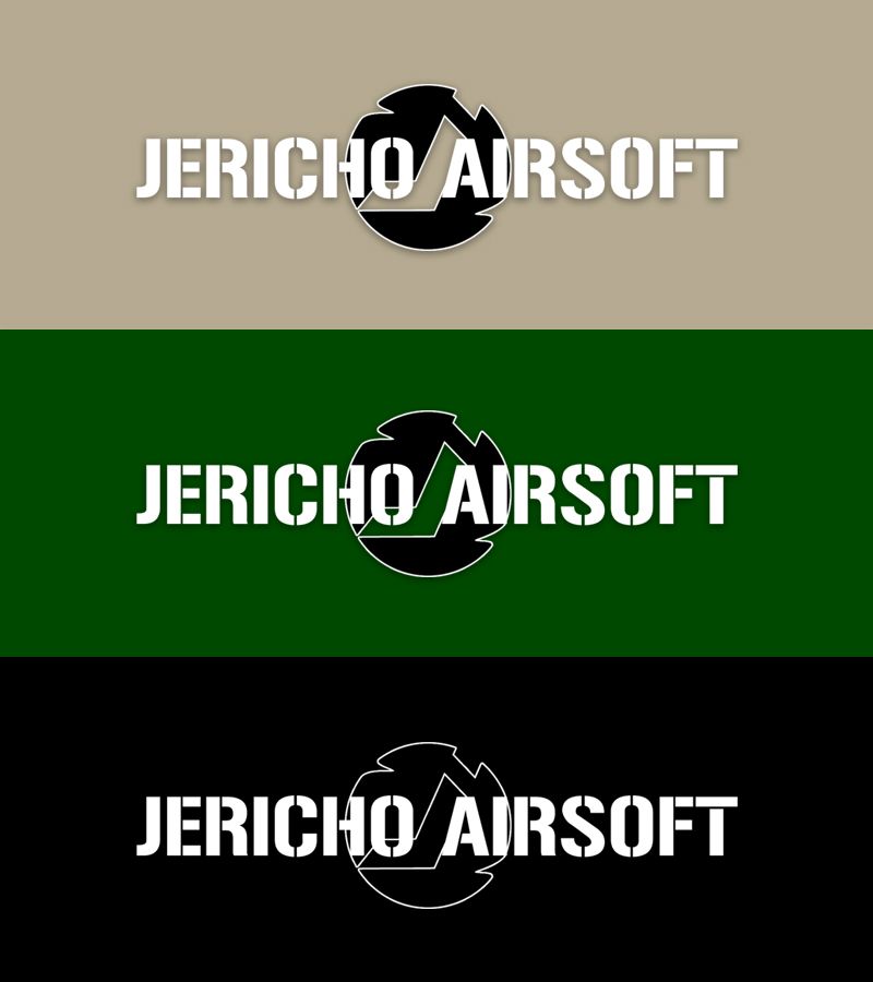
Black and white was used in this logo design, to contrast from a military colored background. It contrasts well from green, black, brown, or tan, when things are printed.
The Spinning BB Logo Mark
There’s an internal part of an airsoft gun called a ‘hop-up’ that places backspin on the bb as it’s fired. This keeps the bb travelling on a flatter trajectory. Without the hop-up, the bbs don’t shoot very far. They just arc down and hit the ground as gravity does it’s thing.

Jericho Airsoft Spinning BB Logo Mark
The ‘spinning BB’ logomark was inspired by the hop-up, and represents a BB spinning from it’s effect.
Including the J in the logomark was so that the logomark and logotype could be seperated, yet still recognized. The plan was for brand recognition to take over once players learned to recognize what the spinning BB represented.
One Color Logo Design
After a few years, we decided to also design a one color logomark. It was based on the original design, that could be just as contrasting on any background.
Here’s how that looked:

Full Local Business Branding
Jericho Airsoft turned into much more than just a logo design project.
I also did the branding for Jericho, which I go into a lot more detail right here.
If you’re interested in a logo design, web design or local SEO, shoot me an email, or give me a call right now!

Recent Comments